
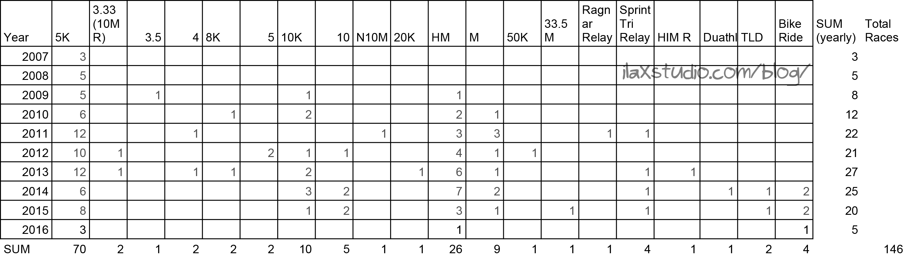
The big graphic below is a bit of overkill with how little I participated in races this year. My racing year is better summed up with these two comparison charts/graphs:
Click to see larger
I participated in a lot less events this year – only five, compared to twenty last year.
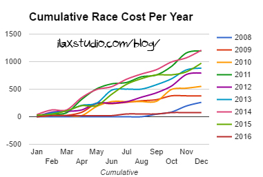
Amount is in dollars
I spent a lot less on racing this year – the least I ever have. The next least amount was in 2008, when I also did five races. The amount I’ve spent is already higher for next year since I didn’t have (on purpose) a free entry for the half I signed up for!
Both of these trends (less races and money spent on races) are because we bought a house in 2016 that requires time and money, and racing took a step down on the priority list. It likely will in 2017 too. That’s alright with me! I actually still exercised the same amount this year, but I definitely was not in racing shape. The infographic might have a few more races on it had I been!
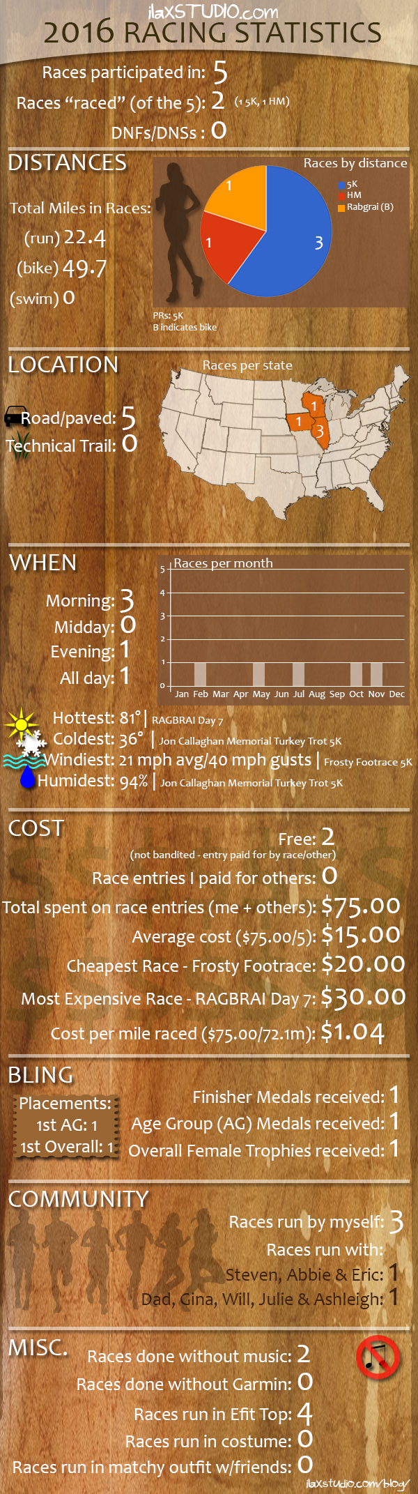
And now, on to the infographic! (You can see 2012 here, 2013 here, 2014 here and 2015 here. You can always find my race stats here.)
Also, if you would like to fill out your own 2016 Racing Statistics in the comments or on your own blog, I created a google doc here for you to copy and fill out/edit!

I was going to write a lot more, but then was distracted by the memory of the effing winds at the Frosty Footrace. Gah.
I raced a lot less this year too. Which is fine. I’ll get back into it next year. We need to plan a race. I think 2016 is the first year in a while that we didn’t run a race ‘together’.
They were horrible! And I didn’t even mention the Wisconsin Half!
I think it is the first time we didn’t race together! Sad! Shall we do trails or roads next year?
Love the graph the table! I think my US map would look the same except swap Iowa with Indiana. I need to look back and see what was my windiest race! 🙂
Thanks! Are you gonna do a 2016 recap?
I should do a recap of my highlights and lowlight(s), I just need to get motivated!
The mood may strike!
I love that you do these every year! Does graphing it out and making the infographic give you new insights, or are these all things that you kind of remember/knew already? I’m always surprised at how much racing adds up, so I was interested in your cost/mile analysis. Will racing take a lower priority in 2017 again because of house stuff, or just because you have other interests at the moment?
Thanks! It does still give me new insights, which I find surprising 🙂
I think it will be a lower priority due to house stuff again. I don’t miss all the racing, but I do miss having more “free” time!
What?!? No Costumes??? Let’s Change That Stat In 2017.
Cheers
I definitely will! 🙂
Duuuuude, this is so much fun! I wish I was more numbers-oriented, then I could show some fun race stats, too. But noooooo, data analysis makes me bonkers. Lol Great year!
Thanks! I track this stuff throughout the year and really enjoy doing this sort of thing. 🙂
I like collecting info so this is making me geek a bit lol I love it. 70 5K’s is a ton. You have accomplished a lot collectively, even if you had a few lighter years race wise.
You made out on race $$ this year!! That is very low, I am pretty sure I would 6 x’s that much and I didn’t race much.
The reason my cost was so low is because the half I did was a free entry and a business paid for another 5K! Next year will def be higher 🙂
I love this every year! I’m already looking forward to doing mine in a couple of weeks 🙂 $75 for the whole year is crazy to me! I usually expect to spend at least that much on one single half marathon, never mind across five different events. But like you said, you had other expensive priorities this year to worry about instead 🙂
Thanks! I can’t wait to see yours! And my cost will definitely go up next year – I am already at $82.31 – for two races!
I love the graphs! It’s really cool to see all this in visual form 🙂 And yeah, it makes sense that racing would be way down with all the work you guys put in on the house.
I did 5 races this year too! I’m happy that 3 of ours overlapped! 🙂 Racing is a lot of fun, but I definitely don’t mind cutting back! I’ll probably do a similar amount next year too (at least, if we can find a replacement for Frosty).
I am happy they overlapped too! Did you pick something for Frosty? I think I am going to look after the holiday 🙂
I look forward to seeing this every year! Great job on another awesome year! I did not race a lot this year because I was focusing on the Chicago Marathon. Next year no marathon for me so I plan to train and PR in a few races.
Thanks! I hope you get your PRs in 2017!